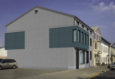
It's not often that a new building is constructed on Warren Street. Ironically, the last time it happened, in 1996 or so, it was the building right next door to the most recent new building: 211 Warren Street.
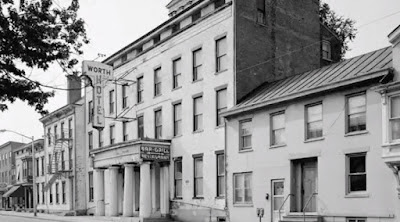
Gossips has documented the sad tale of the building that originally stood on the site, right next door to the fabled General Worth Hotel.
In 2010, there was a fire in the building, which caused significant damage. At that point, the building had been vacant for a few years, and it continued to be vacant and derelict after the fire.
In 2011, the building was purchased by a group called Passive Aggressive Housing. The original plan was to retain the facade of the building and construct a passive house behind it. That plan was granted a certificate of appropriateness by the Historic Preservation Commission in 2015.
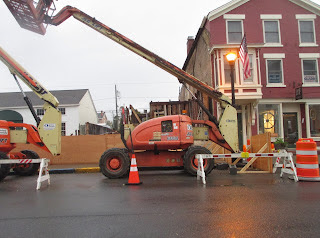
Work did not begin on the project immediately. More than three years passed before any work on the building commenced, and when it did, in October 2018, a foundation collapse, very likely exacerbated by persistent heavy rains, made the preservation of the facade impossible, and the entire building had to be demolished. The demolition happened in early November 2018.
A design for a new building to replace what was lost was presented to the HPC in April 2019.
Over the course of several months, the design evolved into what was finally granted a certificate of appropriateness in November 2019. The design element that carried the day was the ersatz oriel, which in the version of the design immediately preceding the one that was approved had three windows at the front and no windows on the side. In the final design, the oriel has four windows on the front and a window on the side, in imitation of the oriel on 209 Warren Street, the building next door.


Terrible. Should never have been allowed. What were they thinking? Disgraceful.
ReplyDeleteAnd of course it has to be gray and charcoal
DeleteI agree. The design may not be terrible, but the grey bricks are awful. What you would see on cheap construction. Perhaps if the bricks are painted the building can be saved from being an eyesore.
DeleteI love the way modern buildings look juxtaposed with our incredible historic buildings. Since Hudson has such a wide variety of architectural styles, why shouldn't people be able to look back in 100 years and see architecture of this era, mixed in with the incredible range of styles we already have. Whether this one is something that people will appreciate and cherish in 100 years, only time will tell.
ReplyDeleteThank you for your welcome comment! Enough of the NIMBYism in Hudson. I too love a modern influence in our historic context. Great to see something different AND appropriate in Hudson.
DeleteThis is just an awkward mediocre building design with little to no redeeming qualities ... this structure has no pride or presence ... the review board has failed us all ...
ReplyDeleteWe should talk about how it took 3 years to take the scaffolding down that has been hiding a small business behind it the entire time and still after the "reveal" the building is not near finished.
ReplyDelete